
The subtle problem that becomes visible
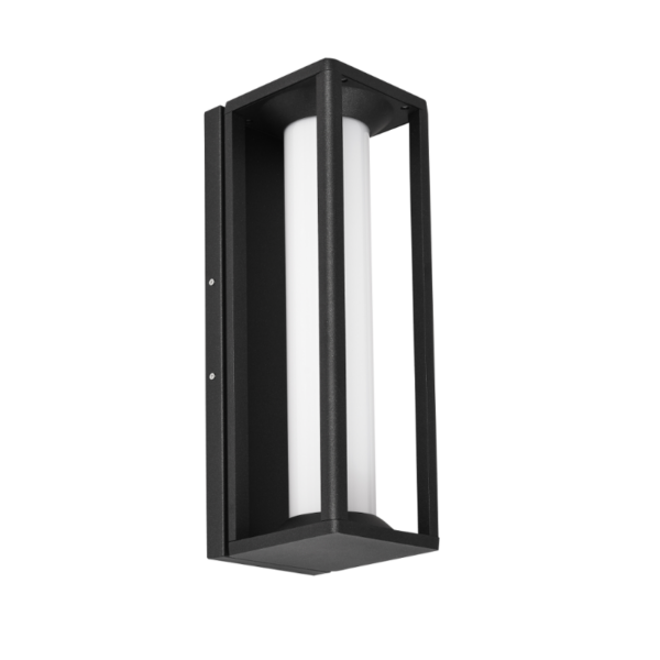
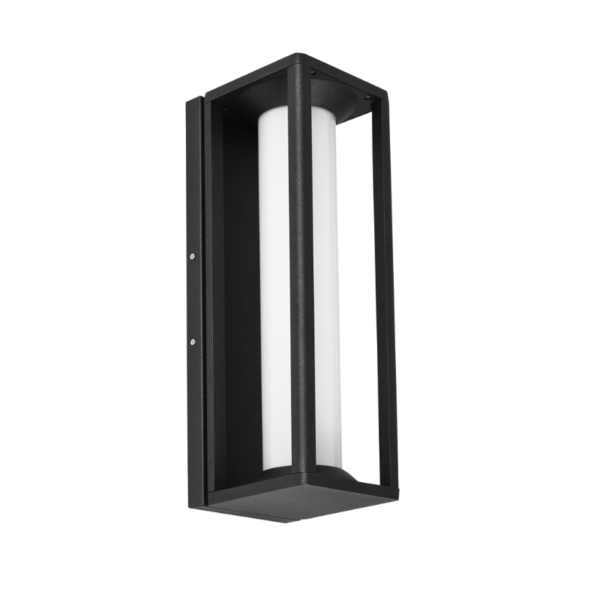
Light should feel intentional — warm, cool, or somewhere elegantly in between — but when correlated color temperature (CCT) drifts across a row of bollards the effect is dissonant: cobbles that once glowed amber start to look washed out, stonework loses depth, and a brand’s carefully curated exterior palette fractures. For projects that also include wall-mounted fixtures, specifiers often compare bollards to other elements like an led outdoor wall sconce or a led wall sconce outdoor to judge harmony. In luxury settings, that discord reads as sloppiness — not a minor technicality but something customers notice before they consciously decide to trust a place.
How perception magnifies technical variance
Our eyes are strangely intolerant of mixed white light. A 3000 K bollard beside one that’s shifted to 3500 K creates a visible color banding that a camera amplifies and social media immortalizes. Designers track color rendering index (CRI) and CCT to avoid that mismatch; think of CRI as how faithfully the light reveals material tones, and CCT as the light’s temperature in Kelvin. When either metric strays, finishes that once read as luxurious—brass, travertine, aged wood—can look pallid or sickly. The sensory gap undermines the intended mood and the brand story the lighting was supposed to tell.
Root causes of CCT drift
Several ordinary installation and product factors are usually to blame. LED binning inconsistencies during procurement place diodes of slightly different CCTs in the same run. Drivers with poor thermal management allow LEDs to warm and gradually shift their output. Environmental exposure—thermal cycling, moisture, salt air—accelerates phosphor degradation. And sometimes it’s as prosaic as mixing batches from different manufacturers with different binning tolerances. These are solvable problems, but they require attention at specification, not just at handover.
A real-world anchor: standards and examples
Lighting professionals lean on the Illuminating Engineering Society (IES) and project-specific tolerances to avoid surprises; it’s common practice to specify CCT tolerances (for example, ±100 K) and to require binning documentation. Large civic projects — the lighting scheme for the 2012 London Olympic Park set a high bar for consistency across public realm fixtures — and designers translated those lessons into tighter controls for hospitality and retail precincts. That real-world precedent shows how industry standards and major projects elevate expectations for private luxury installations too.
How brand image suffers in practice
In a luxury streetscape even small inconsistencies signal neglect. Guests expect a unified atmosphere from approach to entry. Misaligned bollards can make entry plazas feel piecemeal, blur signage legibility, and even alter perceived safety — cooler light can feel clinical, warmer light inviting. For marketing, that inconsistency is costly: photography looks off, social feeds capture the problem, and the resulting impression is difficult to reverse without reinstallation or costly relamping.

Practical specification and installation fixes
Start with clear, measurable requirements: specify CCT in Kelvin, set a maximum tolerance (commonly ±100 K), request LED bin codes and driver thermal specs, and require a first-article on-site mock-up. Choose fixtures with proven lumen maintenance (L70) and stable drivers; these metrics matter for long-term uniformity. During commissioning, measure with a color meter across several installed units and log results before sign-off — and schedule periodic checks into maintenance plans. —These steps transform a technical spec into a visual promise.
Common mistakes to avoid
Avoid three recurring errors: mixing production batches without bin verification, assuming equivalent CCT labels from different vendors, and treating CCT as a “nice-to-have” detail rather than a performance spec. Also, don’t skip prototyping under real field conditions; lab tests miss how coastal humidity or pavement heat will affect color over time. When teams bypass these checks, they save time now and pay in brand dilution later.
Alternatives and trade-offs
If absolute CCT uniformity is prohibitively costly, consider design strategies that mask minor shifts: layered lighting to emphasize focal points, fixture shielding to reduce direct color comparison, or deliberate tonal transitions as part of the aesthetic. Each alternative carries trade-offs — masking can reduce perceived brightness; transitions must be carefully choreographed — but when budget and timeline constrain, they can protect the brand’s visual coherence.
Advisory: three golden rules for preserving brand through light
1) Specify measurable tolerances: demand CCT in Kelvin with a stated tolerance (e.g., ±100 K), require LED bin codes, and hold vendors to them. 2) Validate in situ: insist on an on-site mock-up and photometric/colorimetric readings before final acceptance; don’t rely on datasheets alone. 3) Plan maintenance as part of design: include scheduled checks for driver health and lamp shifts, and choose luminaires with documented lumen maintenance (L70) and robust thermal management.
Applied together these rules cut the risk of visible drift and protect the curated ambience your brand depends on. For teams seeking fixtures that pair tight CCT control with consistent finishes across bollards and wall elements, trust in thoughtfully specified products — and a partner who documents binning, driver specs, and commissioning procedures — is the difference between an installation that feels luxurious and one that merely looks like it tried. Keyida. —